Energetic branding creates synergy for Core Highways Group
Core Highways Group - a leading provider of traffic management and associated highway services – consists of five companies. They wanted to explore options for creating synergy and bringing these businesses together under one consistent identity. Fabrick’s creative team was thrilled to be given such a challenge.
As each of the five businesses were well-known within the industry and had strong individual brands, Fabrick undertook some detailed research to establish the best options. It was important to consider the strategic business perspective and the risks and benefits to the individual businesses of adopting a Group brand and identity.
We looked at the core values of both the individual businesses and the Group as values provide a clear vision of what a company is about and what’s important to it. This needed to be reflected in the design for the new identity so was a core consideration.
Fabrick presented our findings in a roadmap - which outlined how best to approach the challenge of bringing these five, often competing businesses, together as one whilst maintaining their individual value and personality – along with our suggestion of creating an umbrella brand under which each business could operate. This allowed individual business identities to continue whilst benefitting from a shared Group brand and its values.
When talking about their core values; innovation, safety and integrity were key so the design needed to be fresh, energetic but familiar. It also had to be strong enough to stand as the key parent company, but at the same time make sure it was all-encompassing with the sub-brands.
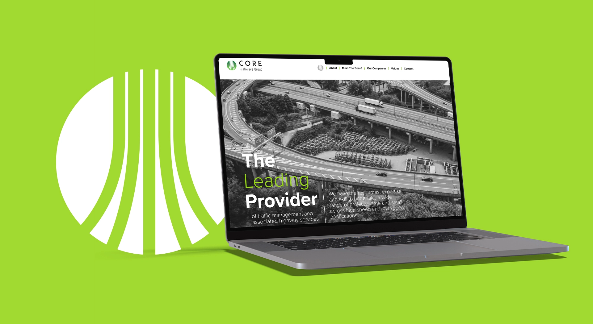
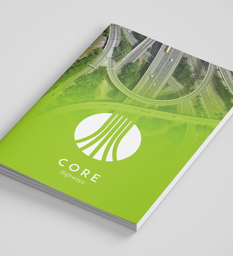
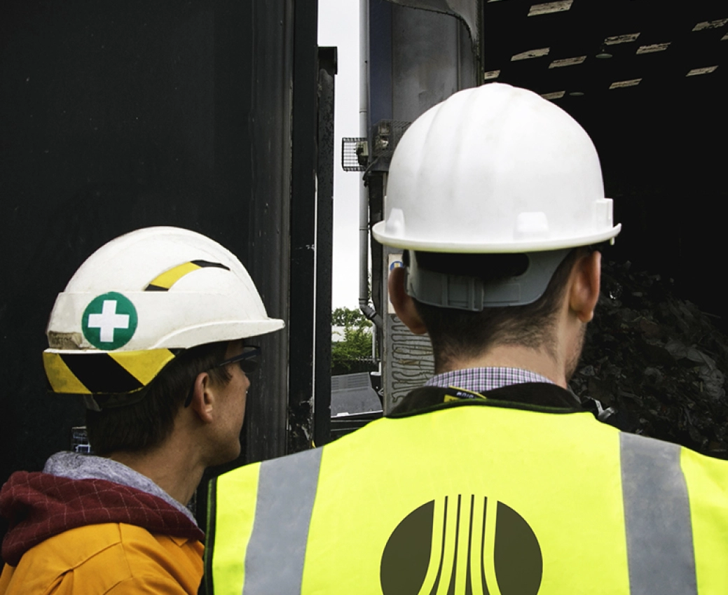
The proposed and chosen logo mark focused on the merging of 5 literal and symbolic lanes, showing one for each group company flowing through a circle.
We felt a strong colour was needed to match the strength of the new identity but it was also key to complement it with some industry colours such as orange and concrete grey in order to bring the sub-brands together. After testing various combinations, we landed with the freshest of the fresh lime green combined with emerald.
As part of the rebrand we also created messaging, tone of voice, a new website and assisted with its rollout and implementation. The new branding has been extremely well received.
Other work
Let’s Talk Ideas
Leave your details below and one of our marketing and PR specialists will contact you to discuss how we can help.